I took the "now" photos of our kitchen last weekend when I noticed the yummy light and I was admiring the work that Doug has done. I love that this kitchen is a combination of Doug's elbow grease and my "Can we please try this color on the cabinets?"
The photo above was taken standing in front of the door that leads to the garage, looking left toward our front door entrance. There's Lucky the dog on his favorite rug, guarding the front door.
Here's what our kitchen looked like when we first bought this house. Notice the arched doorway and front door in the center of the photo...
And after shot below...
 Wow - right?!?! And yes, that is a dish drainer full of clean dishes on our counter. Kind of gives a sense of just stopping by unannounced, eh? I actually took these photos spur-of-the-moment to text to my friend, Connie. I loved them so much that I decided to bust them out in a before/after post, hence the lived-in-factor. There's also a laundry rack later in this post. :o)
Anyway! The hood over the stove wasn't vented to outside, nor was that cabinet high enough to accommodate a microwave/stove hood. Doug raised that section of cabinet a little higher, and a contractor friend of ours installed a vent before finally installing the microwave.
After: similar shot with the living room in the background...
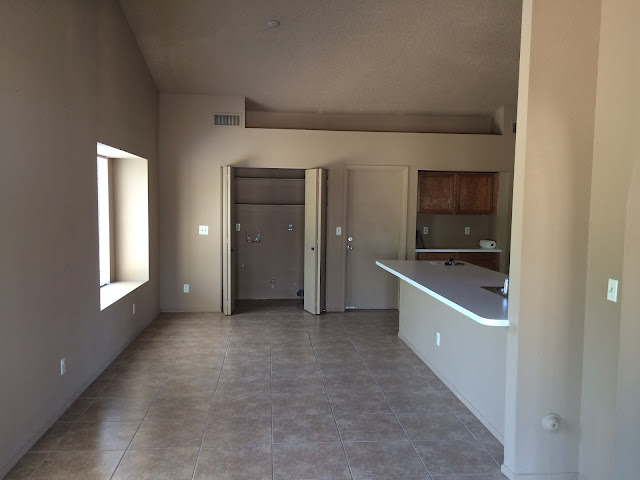
Next shots, before: from backdoor looking into the dining area, with laundry closet straight ahead...
After: Let there be light. And some color! :o)
Before shot standing in living room area looking into the kitchen...
And after... :o)
Next shot - standing in the kitchen looking out into the dining area, back door on the left behind that little wall...
After? Love, love, love!
So, yeah. That's our new kitchen! There are still some things to be added to walls, and I need to decide on window treatments, but we love it already.
It was so fun seeing the before and after photos while creating this post.
I hope you enjoyed it too!
♥


14 comments:
It's very beautiful - such super colours. Definitely magazine-worthy. Many congratulations to both you and Doug!
it's a gorgeous colour! And what a beautiful long counter top. Magazine worthy, indeed
Thanks for the tour of your kitchen - it's lovely. Warm and fresh at the same time. Effort well-rewarded, I'd say!
That looks like something out of an interior design magazine - what a difference. I love those ceiling lights! The colour was a good choice - what a good team you make!
I officially have kitchen envy! I want to sit there with you and chat for hours over a cup of tea!
WOW, is right! This is gorgeous, and it looks like a huge kitchen!
Love, love, love, it's absolutely gorgeous!! Well done!
Beautiful. the colours are so relaxing, peaceful. The heart of the home is reflected in your decorating choices. Your honey certainly did a fantastic job - good thing he listens to his wife about colours (col). I agree with Sian, your kitchen needs to be featured in a home magazine.
Oh wow! What a fabulous transformation! Your kitchen looks so light and bright and fresh! Love the colour you've chosen.
Love the colour....it's all looking gorgeous.
That is an amazing transformation, it looks stunning and it's made me want to go and paint my kitchen right now!
Your new place looks gorgeous! xx
You totally nailed the color scheme on this one. The white makes it look really bright and open and the color of the cabinets really adds a lot of character without being to overbearing. I have to say though, those floorboards look really nice when mixed with the white of the counter tops and the blueish green of the cabinets.
Fred Richardson @ SGK Home Solutions
I kind of like this new lay out you have. It's classy, it's smooth, and it's fresh. You didn't spare any details and you didn't hesitate to take it in a new direction. I think me and my girlfriend might try to do something like this when we get around to it. Nice!
Giovanni @ Coastal Contract Hardware
Post a Comment